Understanding the Principles of Color Matching and Palette Development
If you’ve ever looked at a beautifully designed website, artwork, or even a stunning outfit and wondered, “how did they put those colors together?”, then you’ve already been curious about the principles of color matching and palette development. These concepts are the foundation for creating visually appealing designs, whether it’s for a digital space or in the physical world. In this article, we’ll explore the key principles of color matching and palette development that will help you take your design skills to the next level. So let’s dive in and learn how to create harmonious color combinations that will catch the eye of your audience and make your designs truly stand out.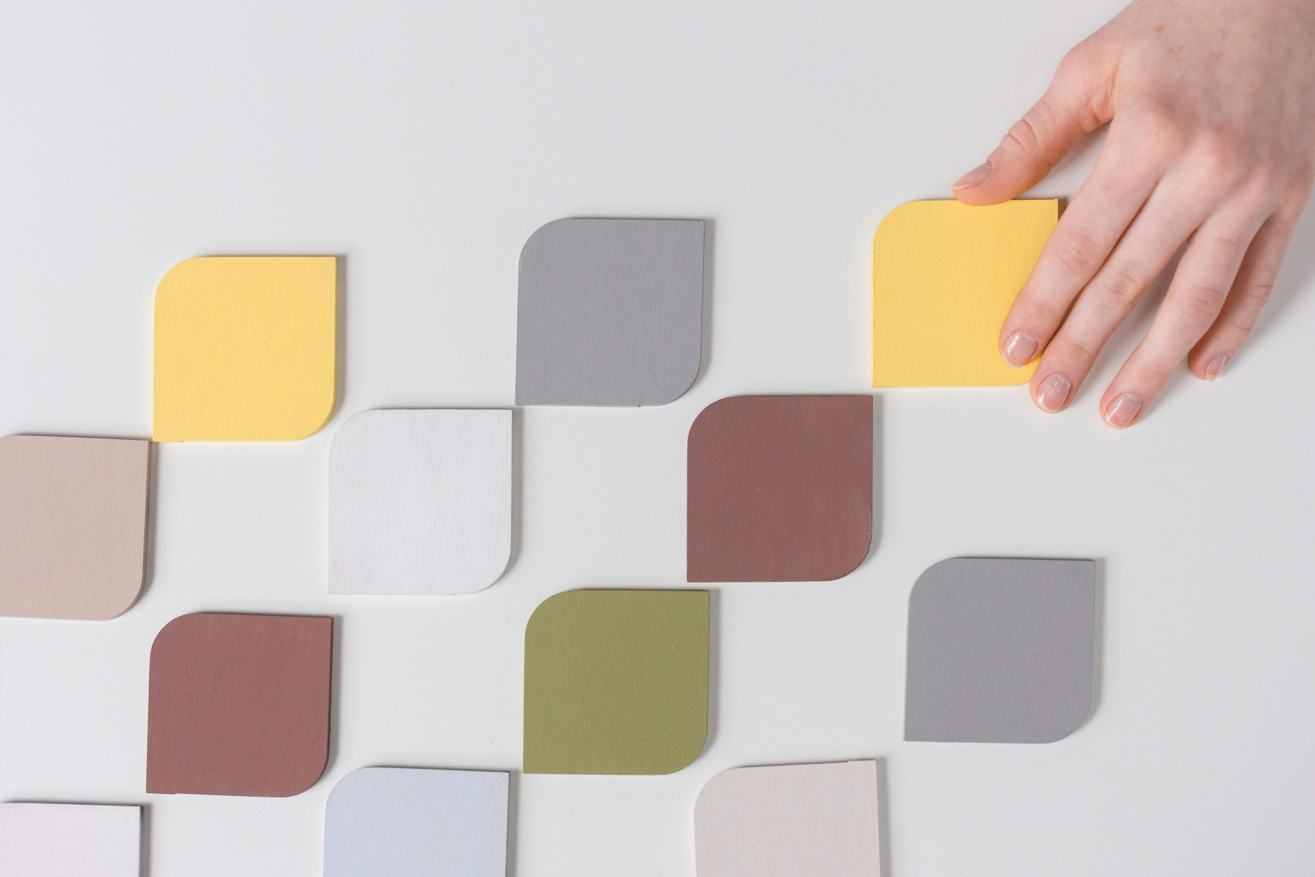
The Importance of Color Matching and Palette Development
Colors play an essential role in design, as they have a significant impact on how we perceive and interact with the world around us. They can evoke certain emotions, convey a specific message, and influence our moods. Therefore, it’s crucial to understand the principles of color matching and palette development to create designs that effectively convey the desired message and evoke the desired emotions.
Color Matching
Color matching, also known as color coordination, is the process of selecting and combining colors that work well together. Matching colors is an art and a science, and it involves understanding color theory and how different colors interact with each other.
Color theory is a set of principles that explain the relationships between colors and how they are perceived. These principles include the color wheel, color harmony, and color contrast. Understanding these concepts is essential for successful color matching.
Palette Development
Palette development refers to the process of creating a cohesive color scheme for a design. It involves selecting a set of colors that work well together and using them consistently throughout the design. A well-chosen color palette adds visual interest, creates balance, and improves the overall aesthetic appeal of the design.
When developing a color palette, it’s essential to consider the purpose and message of the design. For example, warm colors like red, orange, and yellow are associated with energy and excitement, while cool colors like blue, green, and purple evoke a sense of calmness and tranquility. The color palette should also reflect the brand’s identity and target audience.
Creating a color palette involves choosing a dominant color, accent colors, and supporting colors. The dominant color is used the most in the design and sets the overall tone. Accent colors add contrast and visual interest, while supporting colors are used to provide balance and tie the design together.
Tips for Successful Color Matching and Palette Development
Now that we understand the importance of color matching and palette development, let’s dive into some tips to help you create stunning and effective designs.
1. Start with a Mood Board
A mood board is a collage of images, colors, textures, and typography that serves as a visual representation of the design’s overall look and feel. It’s an excellent tool for exploring different color schemes and finding inspiration. Start by collecting images and colors that align with your design’s purpose and message, and use these as a starting point for your color palette.
2. Use the 60-30-10 Rule
The 60-30-10 rule is a popular color theory guideline used in interior design, but it can also be applied to other design fields. It suggests using 60% of a dominant color, 30% of an accent color, and 10% of a supporting color. This rule ensures that the design is visually balanced and doesn’t overwhelm the viewer with too many colors.
3. Understand Color Psychology
Colors have specific psychological effects on human behavior and emotions. For example, blue is often associated with trust and professionalism, while yellow is linked to happiness and optimism. Understanding color psychology can help you select colors that align with the desired emotional response for your design.
4. Experiment with Different Color Combinations
There are many different color combinations you can use in your designs, such as complementary, analogous, triadic, and monochromatic. Experiment with different color schemes to see which ones work best for your design. Don’t be afraid to try unconventional combinations, as they can often result in unexpected, eye-catching designs.
In Conclusion
Understanding the principles of color matching and palette development is crucial for creating visually appealing designs. By incorporating these concepts into your design process and experimenting with different color combinations, you can take your designs to the next level and captivate your audience with harmonious and impactful color schemes.